
📦📑
As part of my summer internship at Amazon, I redesigned the MVP of a desktop platform that provided a single source-of-truth product definition system that generates product definitions according to a standardized framework to improve work efficiency for financial analysts and managers at Amazon.
Throughout my internship, I took initiative to conduct stakeholder interviews, 2 rounds of user interviews and initial testing, and finalize a design document (PR/FAQ) for review. I then synthesized the data into actionable steps, designed a product roadmap, communicated design strategies and capability constraints to my PM and the design and engineering teams, and created 3 iterations of working prototypes with design patterns that can be added into the AWS Polaris components library.
Because my work is under NDA, the full project will not be shown and only samples of work. Pseudo-data is used to replace real data.
Duration: May-Aug 2022.
Tools: Figma, Asana.
Timeline Overview
Discovery Sessions [06/03/2022]
Research Plan [06/06/2022]
Usability Testing Sessions (6) [06/13/2022 - 06/22/2022]
Research Synthesis [07/01/2022]
Proposed changes + prioritized roadmap [07/04/2022]
Present findings and recommendations [07/06/2022]
First iteration design changes in Figma [07/15/2022]
Elicit PM and Engineering team feedback [07/19/2022]
Second iteration design changes [07/25/2022]
Usability Testing Sessions (3) [07/27/2022 - 08/01/2022]
Third iteration design changes [08/02/2022]
Present findings and recommendations [08/03/2022]
Complete deck for final presentation [08/05/2022]
Final presentation [08/09/2022]
Project Overview
To educate myself on this verbose topic, I created visual diagrams to help me and users more easily understand the concept of this product:
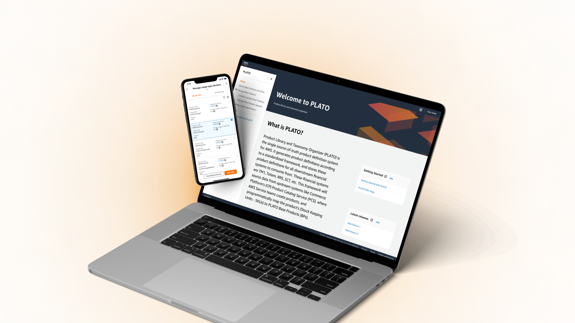
AWS PLATO
Product Library and Taxonomy Organizer (PLATO) is the single source-of-truth product definition system that generates product definitions according to a standardized framework and stores them for all downstream financial systems to consume from

Manage usage type divisor tool
Raw usage amounts for each AWS product SKU must be normalized so that usage can be reported in a consistent unit. The usage type divisor is the factor that makes this normalization happen.

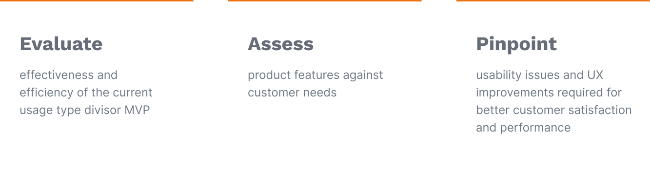
User Research Goals
I focused my research process on these three goals to ensure the best use of time and resources with a goal-oriented design approach.
Research plan
To map out my user interviews, I organized discovery sessions with stakeholders to learn about the current MVP and design objectives and worked closely with my PMs and mentor to align my understanding. I drafted and revised a PR/FAQ that includes background, research goals, evaluation process, users, pre-test and post-test questions, and tasks for users to prepare for my research.
Some tasks I had my users perform included:
View instructional side bar to understand functionality and terminology used in this site
Make a change to a service by inputting a new value to the usage type divisor and changing whether to include it in reporting
Navigate to and understand the meaning and significance of each column of data
Search for results with specific service code and usage type
Filter results to only show services onboarded in a specific time frame

Problem
The PLATO usage type divisors tool is used to aggregate two siloed processes so that customers can review, edit, and filter usage type divisors on a single UI. The MVP needs to be redesigned to allow for more clarity, ease of use, flexibility, and additional functionality.


Original MVP mockup of the Manage usage type divisors tool with limited features and ease of use
Ability to edit Usage type divisor value and Include in reporting
Keyword search
Filter by relative and absolute time range
Target customers
The target users are employees in AWS Finance, Sales and Marketing, and partners of the Finance teams.


Service Finance Analysts
Report month-end performance and forecast businesses they support
Conduct deep-dive analysis to improve business transparency
Interested in improving financial data accuracy and consistency
Concerned about reducing manual product mapping work required and easily bridging between marginal cost and actual cost
Sales and Marketing Finance Analysts
Analyze Sales and Marketing business using daily and monthly estimated revenue data
Calculate quotas, manage sales goals, forecasts, and derive business insights
Interested in improving product data consistency to understand true state of business and bridging different systems
Concerned about identifying all products that AWS offers, which is often not possible using existing tools
AWS Service Product Managers
Develop AWS services and set up new products in product catalog upon new service launch
Set up various pricing strategies for product services
Interested in improving SKU metadata quality in product catalogue and improving overall financial data quality
User interviews
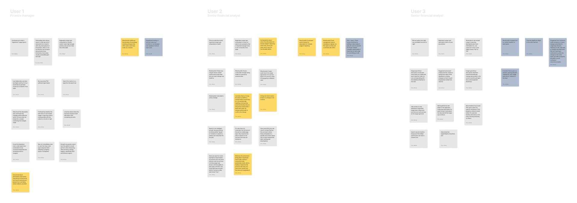
I conducted deep dives with 6 senior financial analysts and managers, walking them through user tasks and interview questions. I noted down the pain points they mentioned, successes and failures/setbacks of the user experience, and how efficiently each detailed user tasks were performed.
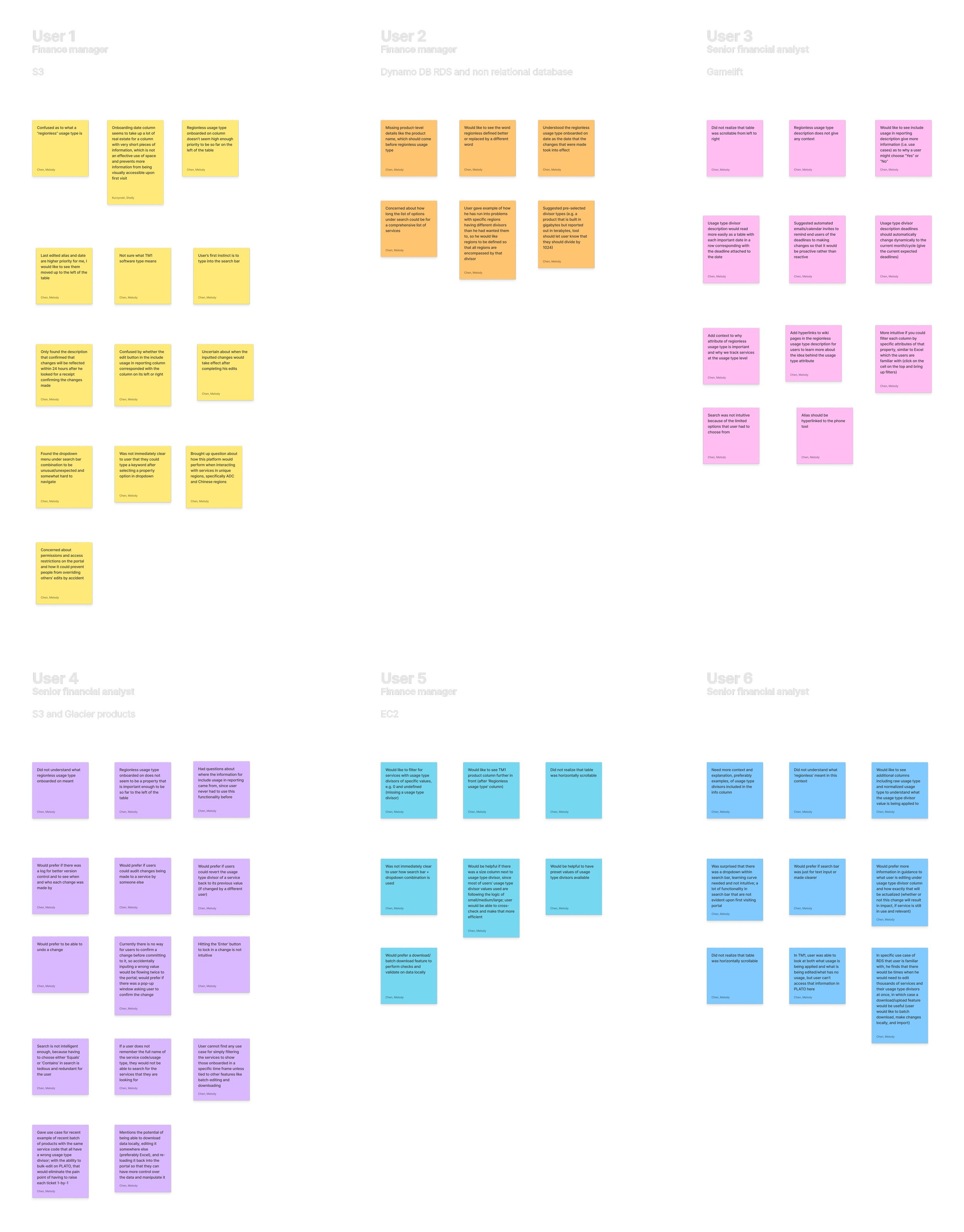

Stage I: Affinity diagram by category
I then began the synthesis of my user research with affinity mapping and organizing my notes by rough categories of initial user feedback.
User research synthesis

Stage II: Affinity diagram by insights
I then broke down the categories into 2-6 specific, actionable user actions per each of the 6 main user insight groups. I then synthesized the insights of each group into How Might We statements and brainstormed design ideas for each question to open up opportunities for next steps.

Stage III: Product roadmap
Taking the many design opportunities I brainstormed, I discussed with my PM to narrow down the most feasible, viable feature changes. Then, I created a prioritized roadmap to most efficiently tackle each challenge. Specifically, I categorized priority (top to bottom) by high/medium/low impact usability issues which are quantified by the number of users who have reflected the issue (refer to Key). These changes are mapped from left to right according to the chronological order of user actions in the user journey.

User testimonials
I collected direct user testimonials that encompassed the main pain points that each HMW statement covered to best illustrate the emotions, level of urgency, and roadblocks involved in the current work process.

Design approaches
I used this framework to prioritize my design approaches and pinpoint specific use cases for each feature change.


Feature 1: Notifications
One of the biggest pain points was users not being able to receive immediate feedback after changing their data, so I edited the description to be more concise with visual icons and added the notifications feature.
Before (MVP)
After (Iteration #3)

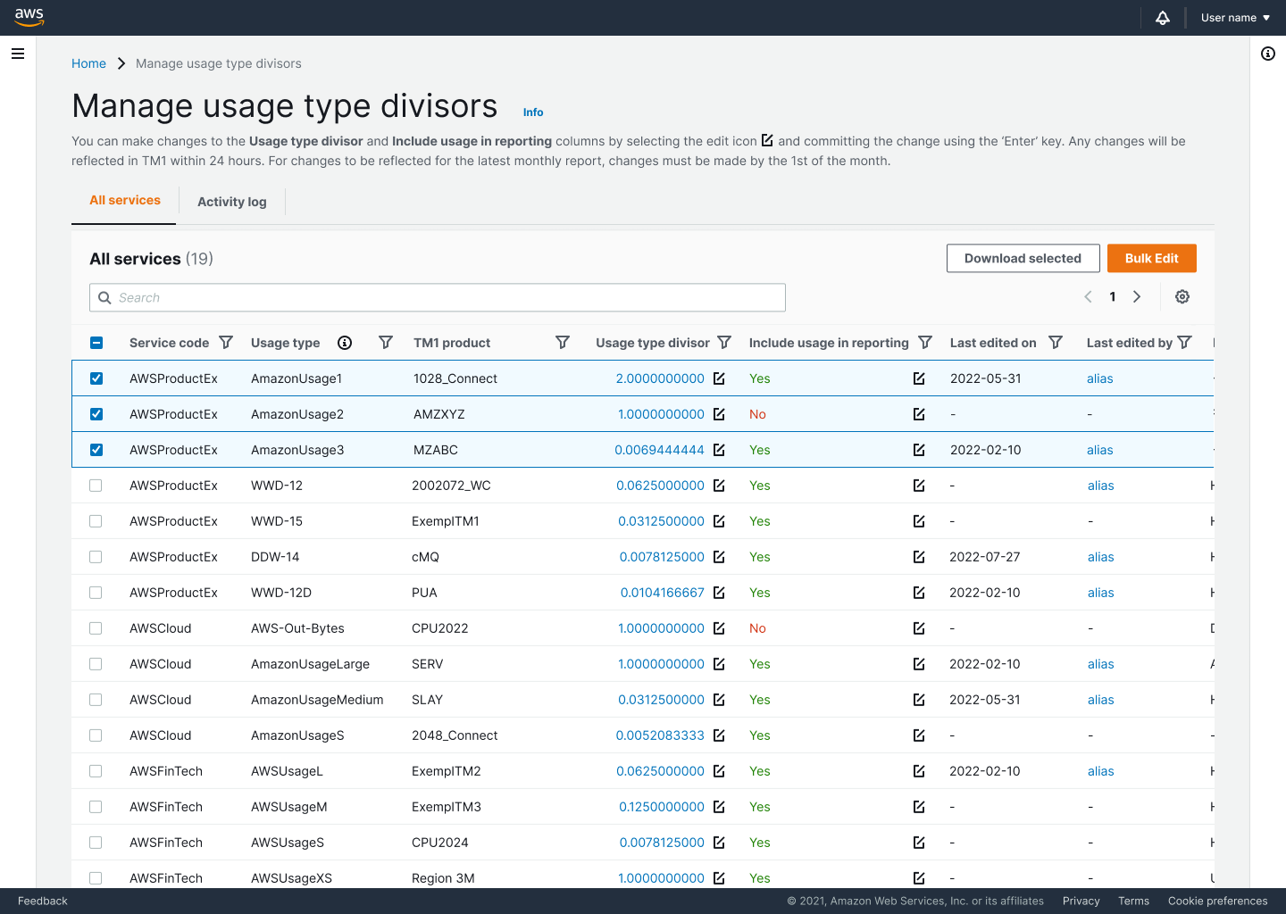
Feature 2: Bulk edit
Many users brought up the use case of managing many service codes (up to thousands!) at the same time, which they needed to do 1-by-1 currently. I added the bulk edit feature to allow for more flexibility and efficiency when managing a large amount of data.
Walkthrough of multi-selecting and bulk editing the usage type divisors of three rows of data
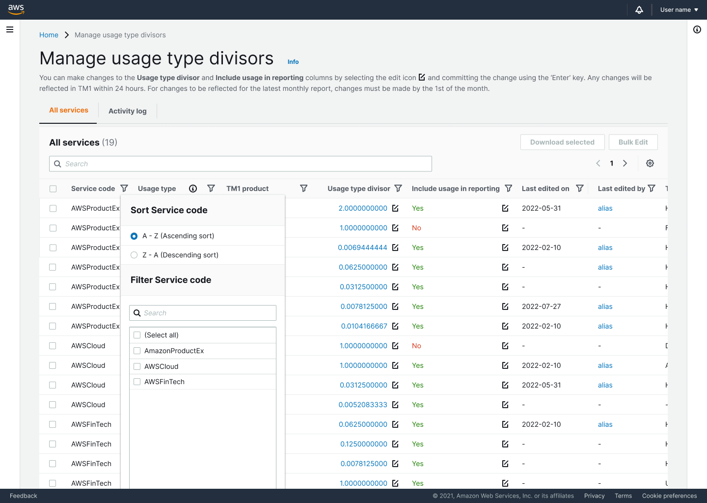
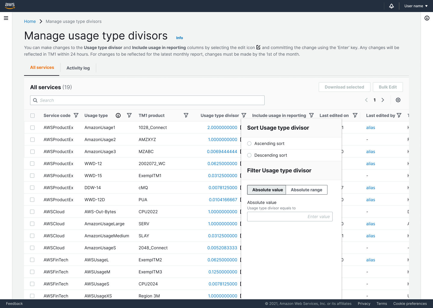
Feature 1: Advanced filters
Users needed advanced search and filter capabilities to cover each use case that there could be, so I implemented a new universal sorting and filtering integrated into the header that allowed for filtering using each column header. Specifically, I took into consideration the value types, I prototyped three use cases of string type, float type, and date.
Before (MVP)
After (Iteration #3)

Feature 2: Bulk download
I added the bulk download feature in addition to bulk editing due to the popular use case of users needing to cross-check and audit changes in Excel, which requires swapping between the two platforms online and locally.
Feature 3: Activity log
I added the Activity log tab so that users have the option to view all changes being committed across the board. This way, managers can easily monitor which changes are being made and revert to previous versions if needed. This feature is used to tackle the common user pain point of not being able to override edits and especially not edits that others have made.
Feature 4: Version history
In addition to horizontally viewing all changes, users can also vertically view all past versions of an entry using the version history function. I innovated upon the static data and added links to each usage type divisor value, which brings up pop-up windows for every past value of the usage type divisor as well as the alias for the user who committed the change to facilitate easy communication.


Design change 1: Reworking terminology
Original column headers were verbose and difficult to understand. New headers were made more succinct.
Design change 2: Simplifying ‘Info’ panel
Users had a hard time understanding the paragraphs in the ‘Info’ panel detailing the technicalities of each column. I removed redundant information, added hyperlinks to Wiki pages to redirect to more information, and added dynamic data that adapted to each reporting cycle.
Design change 3: Adding hover states
Hover states were added to column headers so that users can intuitively learn more about the data below.

Design change 1: Re-ordering data by hierarchy
The original column orders did not reflect the accurate information hierarchy. According to the importance of columns that users detailed, I re-structured the data to reflect the correct hierarchy.
Design change 2: Improving responsiveness
I added truncated and wrap-text views to add more responsiveness and customizability to the tables. This accommodates for different user habits when it comes to denser data.
Next steps and recommendations
II. Updates deep-dive
I synthesized each point of feedback into main takeaway -> design approaches -> implemented changes.


I. Follow-up user research
I reached out to 3 of the 6 users to conduct a second round of usability testing using the final iteration of the new MVP. I focused on tasks and questions that could unveil deeper insights about completely new features and ones that my PM and I were still uncertain about.
III. Successes and next steps
I presented successes as quantified from user satisfaction and task completion metrics as well as plans for A/B testing that the design team can continue to carry out to the PM and engineering teams and managers.


Mobile prototypes
In the last few days of my internship, I played around with the mobile version of this prototype. Although there weren’t any previous mobile platforms created in AWS FinTech, this was an initiative which was discussed so I designed simple mockups in case mobile will be undertaken in the future.
Key takeaways

Special shout-out to my lovely team who made my summer in Seattle an absolutely unforgettable one!
Ask the right questions to the right people
Everyone has a lot to offer in their respective areas of expertise, so being curious and throwing out questions can really help me grow. I’ve learned so much about UI best practices from designers, tips about interview questions from mentors, how to think about and break down big problems from PMs, and just general life wisdom from everyone!
Customer-obsessed applies to everyone
Amazon is extremely customer-obsessed, which has become a lesson I’ve taken with me for the rest of my design journey. However, I found that it applies to any scenario that involves people - in presentations, your audience is your customer; in interviews, the interviewer is your customer… to have someone listen means you need to speak from their perspective first.